Thursday 28 June 2012

My first ever DT project!

So here it is, my FIRST ever DT project! I am very excited to be able to share these layouts with you. I would also like to thank Tracey & Sarah from Pages 2 Scrap for giving me the opportunity to work with them and the other Page 2 girls for the next 6 months.

My first layout is a simple 8.5 x 11 page of my hubby Michael. I really liked the way the Echo Park Papers - For The Records Collection supplied to us in our DT kit were so very versatile. As I mentioned in my bio, I have a passion for vintage/shabby style layouts but also play with clean lines. In this layout, I kept things very clean (for me anyway!). I did manage to get a little bit of black ink on the edges!! I used all the papers supplied in the kit (as listed below) as they are doublesided and co-ordinate beautifully. We were also given the Alpa Stickers which I used for the title.


For my second layout I once again used all the papers in the range! I also used the little cutoff strip at the bottom of the paper. I decided to distress each piece of paper that I randomly cut into varying lengths and widths and then just layered them - no real rhyme or reason in it! In this layout I decided to give the edges of the Tomato Cardstock a bit of a shabby edge by wiping it with bleach. Yes, thats right, just ordinary household bleach. The gorgeous Donna Downey stamp was also given the bleach treatment and to my amazement, the cardstock changed colour a few times and once completely dry it stayed the colour it is now. I was thrilled with my Jenni Bowlin Bingo Card as it worked perfectly with my photo of my daughter Rhyallie & her BFF Kayla.


Lastly with my third layout I got dirty and so did the paper!! I was going for a masculine look to compliment the picture of my son Nic's first tattoo. To give depth to the ink splotts, I actually used the Brillance re-inker and a heat tool. The ink bubbled and made the paper buckle which added depth to the page. Again I used the Alpha Stickers, and changed one of the stickers to suit my title. I stuck the word "the" over the top of the sticker "with love" to make the title "You are happy with the tough sticker". Another little trick I learned if only by accident......when you heat the ink on the page, you can actually make the ribbons crinkle and curl by hitting them with a bit of heat from the gun! Be careful though not to burn them!


Thanks for looking and I hope that you have a great month..........until August.


Tuesday 19 June 2012

This layout was done using a kit from the fabulous Carol Mead and her shop called Tattered Inspirations. She has an etsy shop and sell some of the most amazing ephemera, vintage laces and doilies and handmade hat pins. I will have posted her link here : - Tattered Inspirations. It is well worth a look when you get chance! I have the privilege of being on Carols guest Design Team for the month of August this year, and I am a little bit excited to say the least!!

This layout is yet another of my favourite sizes 8.5 x 11. I find with this size, it is very easy to keep it simple! This picture was taken a few years ago now (clearly when all 3 children got on with each other!! LOL). I was rushing off to a camp and needed a recent picture of them all. It is one of my favourite pictures of them together!

This set of cards I did as a challenge! I was bored, looking for inspiration and my MOJO was just not flowing. So, I rang my go-to friend Jane Clark. She said, I bet you cannot do anything with the following colours......red, brown and turquoise! Challenge accepted!! I didn't have turquoise card stock so I substituted it for a blue that was in my stash. I was quite happy with the results...what do you think? The colours are quite striking together.

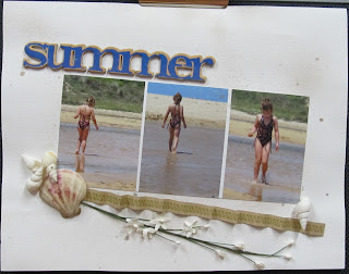
A very simple layout, using minimal product. Another 8.5 x 11 using the photos as the feature. In the background is a little spray of glimmermist, some real shells, a small green tara sprig of flowers and a strip of paper folded to give a bit more depth.

This layout was a challenge done at Camp Mojo last year run by the fabulous Sherry Mendoza and Jane Clark. From memory (which is slowly fading!!) we had to do a layout with a song title as our inspiration. As you can see, I can't resist using vintage things in my layouts!

Splish Splash...this layout was inspired by the gorgeous colours in the butterfly. The butterfly was part of a kit I bought from RaineCloud and I had the chipboard. I had also just got into using glimmermist and really liked the simplicity of this layout. How cute is the ribbon roses on the bottom??